Elevating the marketplace through UX
Too Good To Go is a marketplace (B2B) for surplus food to be saved, connecting consumers with unsold items from local stores. The platform was organized around individual item listings, with partners navigating Surprise Bags one at a time.
My role
Senior Product Designer
Team
Product team: Product Manager, Data Analyst, Engineers and Localization Managers
Scope
User Research, UX/UI Design, Implementation
Tools
Figma , Usability Testing
Company
Too Good To Go
Year
2023
Partners struggled with understanding and managing their Surprise Bags due to:
Limited visibility and control over how their offers were presented.
Inventory would often go unnoticed, leading to unclaimed surplus.
No real-time feedback loop on item status or user activity.
Problem Statement
Rebuild the marketplace around store-level discovery, improving clarity and control for store partners.
Improve visibility into their inventory.
Enable better sell-through performance.
Elevate brand perception via better presentation.
Increase user trust in the store’s offers.
Goal
We conducted user interviews to uncover key pain points.
Key Findings
Partners found it difficult to browse multiple items offerings quickly, by using a dropdown in the menu. This made it harder to get a comprehensive view of a store’s inventory.
Partners often didn’t know if items were sold, available, or being collected, leading to confusion and frustration.
Research & Insights
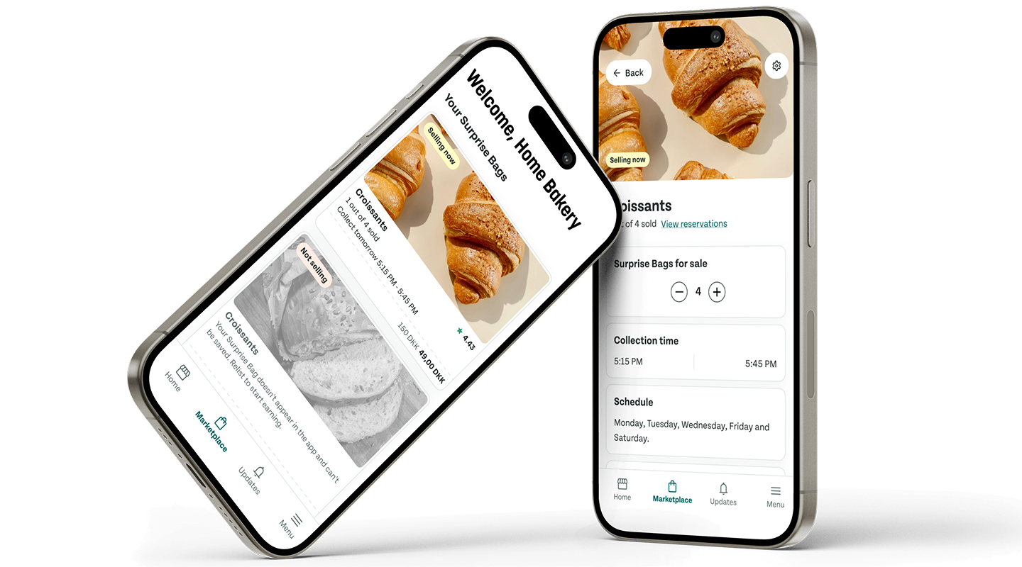
Store-Level Pages
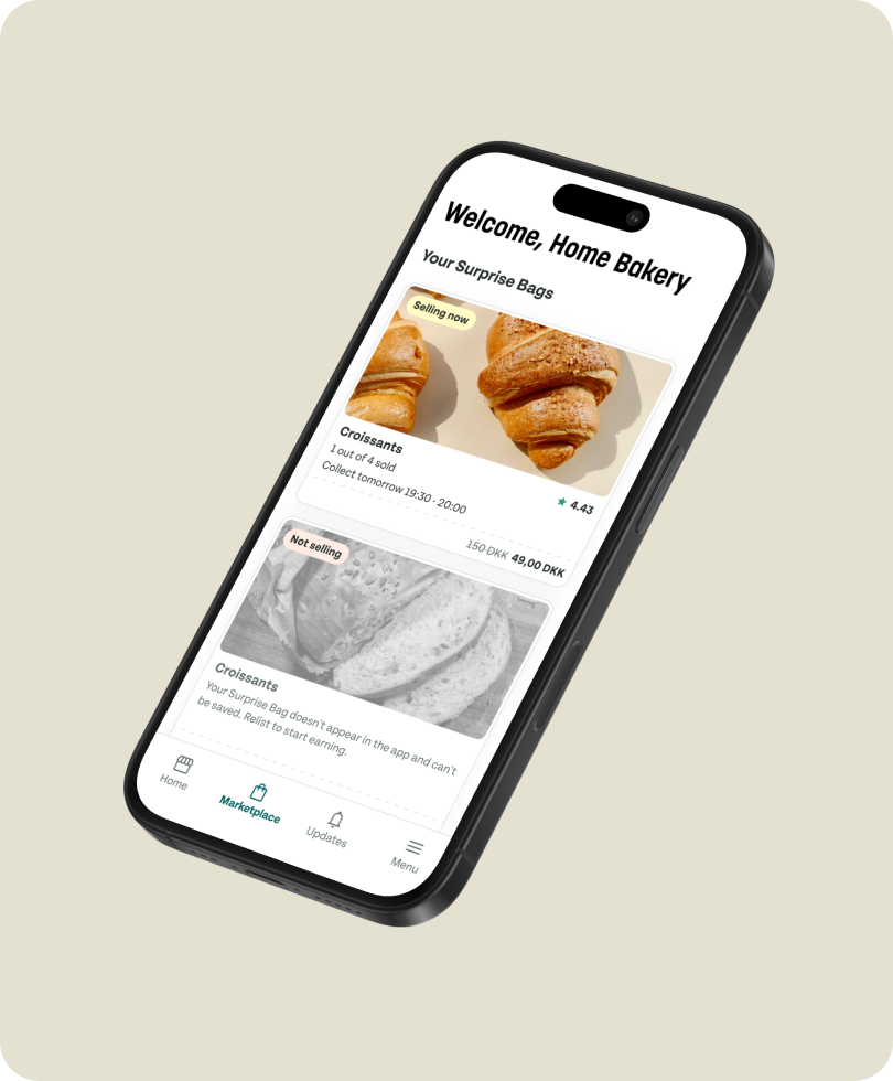
Each store now has its own dashboard. This creates a destination for partners, encouraging repeat visits and making it easier maintain their inventory.