Design in Tune, Building an Design System
Moodagent is a cross-platform music streaming app designed to deliver personalized listening experiences. The app’s interface was previously fragmented across Android and iOS, causing inconsistent user interactions and slowing down development. The design system streamlined components, improved accessibility, and aligned design and engineering teams for faster, more consistent product delivery.
My Role
As the Lead Product Designer on this project, I was responsible for driving the entire design system initiative from the ground up. I led the audit, defined the structure and principles, and created a library of accessible, reusable components for both iOS and Android. I worked closely with developers to make sure everything was implemented accurately, and built detailed documentation to support scaling and onboarding. This project gave me the chance to combine strategy, hands-on design, and cross-functional collaboration to solve real product and team pain points.
Team
UX designer, iOS & Android developers, and Product Manager.
Company
Moodagent
Year
2022
The app’s UI was all over the place, with inconsistent experiences between Android and iOS. Handing off designs to developers wasn’t smooth because specs weren’t clear, which slowed things down. Accessibility wasn’t really baked into the core components, making it harder for some users. And on top of that, the system wasn’t scaling well, every new feature or screen just added more complexity and delays.
Problem Statement
The goal was to build a solid, scalable design system that brings consistency across Android and iOS, makes life easier for both designers and developers, and ensures the app is accessible to everyone. Ultimately, I wanted to speed up development, reduce design debt, and create a foundation that can grow smoothly as new features roll out.
Goal
We conducted user interviews, competitive analysis, and usability tests to uncover key pain points.
Key Findings
The UI audit showed lots of inconsistent patterns and duplicated components across platforms, which confused users and slowed down design updates.
Developers struggled with vague specs and missing interaction details, causing rework and delays.
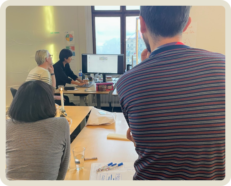
Accessibility wasn’t prioritized early on, resulting in e.g. low contrast colors.
Teams felt the system was hard to scale because new features kept adding complexity without clear guidelines or reusable components.
Early collaboration between designers and developers was missing, which made catching issues late in the process common.
Research & Insights
Audit & Foundation
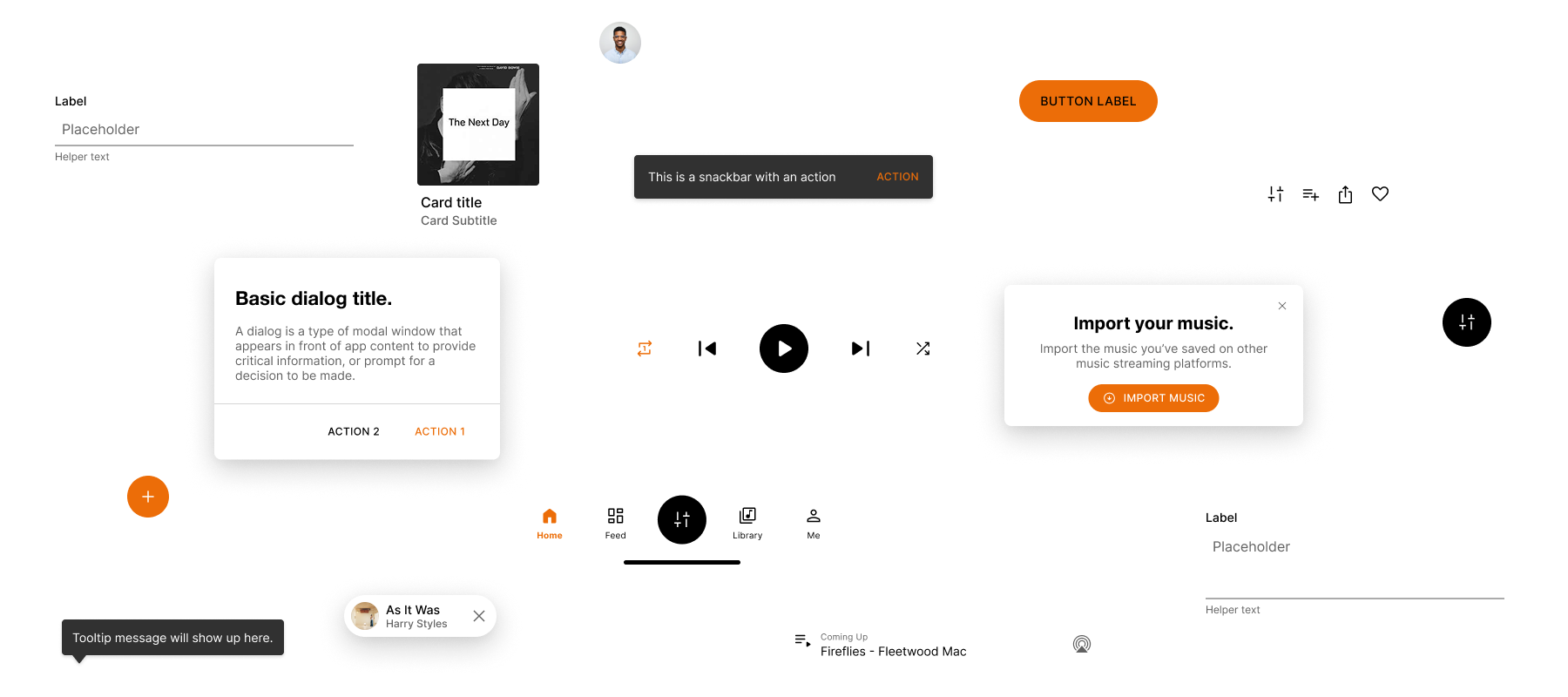
-> Conducted a thorough audit of existing UI elements, identifying inconsistencies and accessibility gaps
-> Created a unified design token library (colors, spacing, typography)
-> Established native component foundations aligned with platform standards: Material Design (Android) and Human Interface Guidelines (iOS)
Component System

-> Designed and documented 40+ core components (buttons, cards, modals, navigation elements, etc.)
->Incorporated component states: default, hover, active, disabled
->Addressed platform-specific behavior and styling variations
-> Ensured WCAG 2.1 AA compliance for color contrast and keyboard navigation
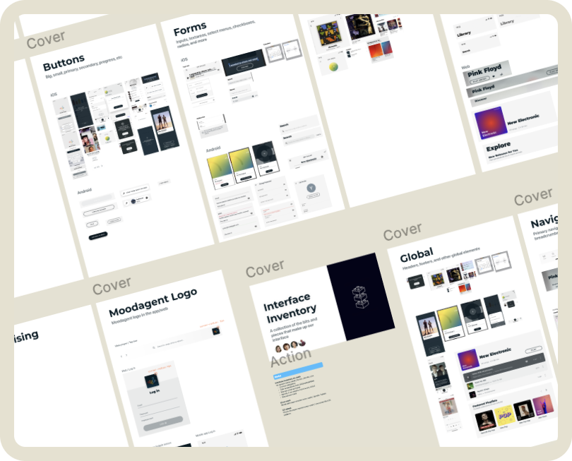
Design + Development Collaboration ❤️
-> Design + Development Collaboration
-> Embedded a developer within the design team during early phases for rapid feedback
-> Delivered interactive designs using Figma and Storybook previews
-> Hosted weekly alignment reviews
Adoption & Governance
-> Created a centralized documentation hub with clear guidelines, dos/don’ts, and component anatomy
-> Onboarded new designers and developers via live walkthroughs and usage kits
-> Established a governance model to review component requests and updates, ensuring long-term system integrity
-> Accelerated design-to-development cycle through shared libraries and clearer specs
-> Reduced design debt across platforms
-> Improved accessibility scores in QA and usability testing
-> Achieved higher design consistency